You don't need JavaScript to support theming
 Ethan Standel
3 min read
Ethan Standel
3 min read
Published 9.18.22
CSS
CSS variables
Media queries
A11y
Interactivity
UX
CSS variables as theme tokens
It seems like every CSS solution has a different model of the theming problem. Emotion uses React Context to store a theme as a large object of atomic state. Tailwind tries to bundle theme values at build time. SCSS will offer you build time variables.
But did you know that in the Cascading Style Sheets language known as CSS, that variables cascade?
Just maybe not exactly in the way that CSS is usually known to cascade.
If you set variables on an element, those same variables cascade to every element below in the tree.
They're effectively custom properties and so all they can do is inherit from up the tree.
So if you want to support theming using only the CSS magic that W3C has given us, then you just need to set a palette as a set of variables on your html or body element.
html {
  --palette-background: aliceblue;
  --palette-text: #212121;
}

html, body {
  background-color: var(--palette-background);
  color: var(--palette-text);
}
Aligning with your user's system themes
And with that, you've defined a theme.
But how can you make it dynamic without JavaScript?
For that we have the media query prefers-color-scheme, which will identify the user's system theme preference and adjust styles accordingly.
The traditional move would be that you define a light palette as a default and then provide dark styles for those whose devices idenitfy that preference like so.
html {
  --palette-background: aliceblue;
  --palette-text: #212121;
}

@media (prefers-color-scheme: dark) {
  html {
    --palette-background: #20201c;
    --palette-text: #eeeeee;
    // this will give you dark scroll-bars on MacOS & Windows
    // and fix default text colors (including visited/unvisited anchor tags)
    // to have a better contrast against dark backgrounds
    color-scheme: dark;
  }
}

html, body {
  background-color: var(--palette-background);
  color: var(--palette-text);
}
And that's basically it, with that, you can get a site that, without any JavaScript, themes itself according to the user's system theme and falls back to a light theme as a default.
If your site or brand aligns more with a dark theme by default then you also can have the dark styles on the default and use @media (prefers-color-scheme: light).
However, that will only affect a small portion of users whose devices don't yet identify theming, which Windows, MacOS, Android, and iOS have all done for a few years now.
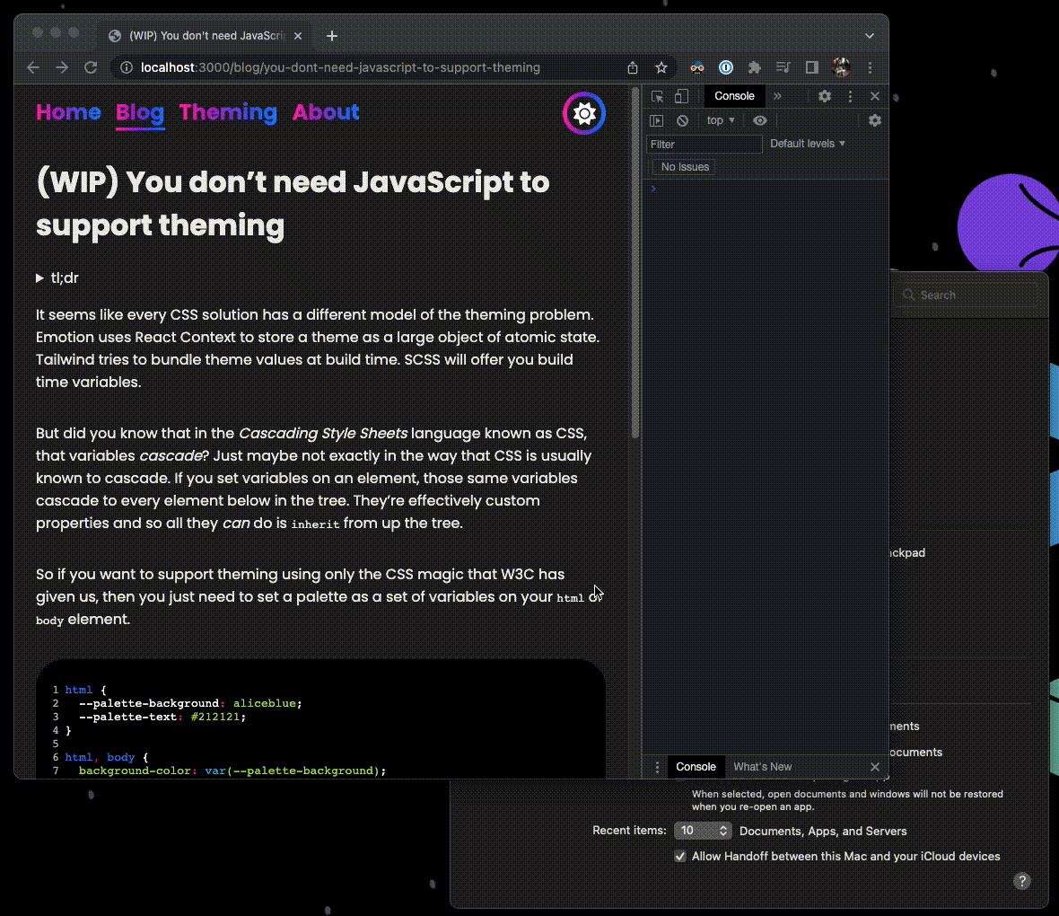 Fig 1. A beta version of this site dynamically adapting to system theme after JavaScript has been disabled.
Conclusions
This is a really easy solution to a concept that has been wildly overcomplicated and runtime-limited for a few years now. There's not really any reason not to start implementing this as a solution at least on all greenfields projects in the future. This solution is native to the browser, so it works in every framework and the browser support has been solid across all major browsers for a few years now. Every webdev should take any opportunity you possibly can to offload JavaScript logic into HTML & CSS for the performance and accessibility of their applications. It also makes us dark-mode users really happy when a website natively supports our preferred theme.